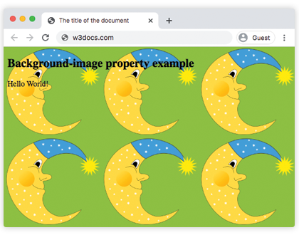
The background-image property specifies background images for elements. There can be used one or more images.
By default, a background-image is vertically and horizontally repeated and placed at the top-left corner of the element.
The background of an element is the total size of it including padding and border (not margin).
If the image is unavailable, you need to specify a background-color.
| Initial Value | none |
| Applies to | All elements. It also applies to ::first-letter and ::first-line. |
| Inherited | No. |
| Animatable | No. |
| Version | CSS1 + some new values in CSS3 |
| DOM Syntax | object.style.backgroundImage = "url(img_tree.png)"; |
Syntax
background-image: url | none | linear-gradient | radial-gradient | repeat-linear-gradient | repeat-radial-gradient | initial | inherit;Example of the background-image property:
<!DOCTYPE html>
<html>
  <head>
    <title>The title of the document</title>
    <style>
      body {
        background-image: url("/uploads/media/default/0001/02/55a2f152f59bf42a99b576d44a4578ec9daa0ab6.png");
        background-color: #8ebf42;
      }
    </style>
  </head>
  <body>
    <h2>Background-image property example</h2>
    <p>Hello World!</p>
  </body>
</html>Result

See another example where two images are used and they are specified with the help of the background-position property.
Example of the background-image property with other background properties:
<!DOCTYPE html>
<html>
  <head>
    <title>The title of the document</title>
    <style>
      body {
        padding: 100px;
        background-image: url("/uploads/media/default/0001/02/55a2f152f59bf42a99b576d44a4578ec9daa0ab6.png"), url("/uploads/media/default/0001/01/b408569013c0bb32b2afb0f0d45e93e982347951.jpeg");
        background-attachment: fixed;
        background-position: 5px 50px;
        background-repeat: no-repeat, repeat;
      }
    </style>
  </head>
  <body>
    <h2>Background-image property example</h2>
    <p>The background image is positioned 5px from the left, and 50px down from the top.</p>
  </body>
</html>In this example a "linear-gradient" with two colors is specified as a background image for a <div> element:
Example of the background-image property with the "linear-gradient" value:
<!DOCTYPE html>
<html>
  <head>
    <style>
      div {
        height: 300px;
        background-image: linear-gradient(#eee, #1c87c9);
      }
    </style>
  </head>
  <body>
    <h2>Linear gradient as a background image example</h2>
    <p>This linear gradient starts at the top. It starts gray, transitioning to blue:</p>
    <div></div>
  </body>
</html>Example of the background-image property with the "repeating-radial-gradient" value:
<!DOCTYPE html>
<html>
  <head>
    <title>The title of the document</title>
    <style>
      div {
        height: 300px;
        background-color: #cccccc;
        background-image: repeating-radial-gradient(#8ebf42, #eee 15%, #ccc 30%);
      }
    </style>
  </head>
  <body>
    <h2>Radial gradient as a background image example</h2>
    <div></div>
  </body>
</html>Values
| Value | Description |
|---|---|
| url | Defines the url of the image. It can be specified more then one image separated by commas. |
| none | There will not be any background image. It is the default value. |
| linear-gradient | A linear gradient is specified as the background image. |
| radial-gradient | A radial gradient is specified as the background image. |
| repeat-linear-gradient | Repeats a linear gradient. |
| repeat-radial-gradient | Repeats a radial gradient. |
| initial | Sets the property to its default value. |
| inherit | Inherits the property from its parent element. |
Browser support
|
|
|
|
|
|---|---|---|---|
| 15.0+ |
4.0+ 3.6 -moz- |
7.0+ |
11.5+ 10.1 -o- |
Practice Your Knowledge
Quiz Time: Test Your Skills!
Ready to challenge what you've learned? Dive into our interactive quizzes for a deeper understanding and a fun way to reinforce your knowledge.